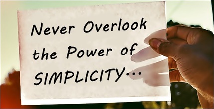
 Crowded places tend to be loud, confusing and chaotic—often causing people to scurry to a more orderly area. Websites are no different. If a site is overflowing with images, colors and giant blocks of unnecessary text, it obstructs customers' views of whatever it is you really want them to pay attention to, and they end up lost in the frenzy. This creates uneasiness and stifles the desire to be there at all. Bad design is bad functionality, and that equals lost customers. Websites should be uncluttered, easy to navigate and have a clear call to action. (Yes, less can really be more.) Good design is a well-balanced combination of images, copy and whitespace. Concise content and some breathing room between images and text create a welcoming online experience that invites action (a purchase, an email sign-up, etc.). With just mere seconds to grab their attention, be thoughtful about your approach and make it count.
|
About UsIf I can help a business owner create the brand they're looking for, my job is done. Archives
April 2020
Categories
All
|

 RSS Feed